Candlestick charts tell valuable things about market sentiment and price action. Patterns such as Doji, Engulfing, and Hammer provide signals about potential market reversals or continuations, helping traders make informed decisions.
History
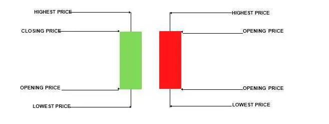
In the 1700s, Homma , a Japanese rice trader, developed the candlestick charting method. Over time, it gained popularity and became widely used in financial markets. Candlestick charts have a significant impact on market psychology and are known for their ability to reflect market sentiment through patterns such as bullish, bearish, high, and low. The rectangular portion of a candlestick chart, called the “body,” represents the difference between the opening and closing prices. The lines extending from the body, called “wicks” or “shadows,” indicate the highest and lowest prices reached during the trading period, providing insights into market dynamics.
The “wick” or “shadow” of the candlestick chart represents the range of trading activity during the given time period.
Red Candlestick
When the candlestick bodies are filled, and the color of the candlesticks is red, it indicates that the closing price is lower than the opening price. This pattern is commonly referred to as a “bearish” candlestick. When a bearish candlestick forms, it suggests that selling pressure has increased, and there may be a potential downtrend in the market. Compared to the opening of the session, a bearish candlestick with a long upper shadow and a short lower shadow indicates that sellers dominated the trading session from start to finish, resulting in a significant decline in prices.
Green Candlestick
If the candlestick body is green, or “bullish,” it indicates that the closing price is higher than the opening price. This pattern is commonly referred to as a “bullish” candlestick. When a bullish candlestick forms, it suggests that buying pressure has increased, and there may be a potential uptrend in the market. Compared to the opening of the session, a bullish candlestick with a long lower shadow and a short upper shadow indicates that buyers dominated the trading session from start to finish, resulting in a significant increase in prices.
The Highest And Lowest Prices Indicator
The thin lines extending from the top and bottom of the real body of a candlestick, known as “wicks” or “shadows,” indicate the highest and lowest prices reached during the trading session. These wicks represent the range of price movement during the session. If the upper shadow is longer than the lower shadow, it suggests that the session’s high was reached with less conviction, indicating potential weakness in the uptrend.
When the upper shadow of a candlestick is longer than the lower shadow, it indicates that the session’s high was reached with less conviction, potentially signaling weakness in the uptrend. This suggests that although the price briefly reached higher levels during the trading session, it encountered resistance and failed to maintain those levels. As a result, there may be downward pressure on prices, leading to a potential decline in the market.

- Highest Price: The highest price reached by the asset during the option period.
- Opening Price: The price of the asset at the beginning of the option period.
- Closing Price: The price of the asset at the end of the option period.
- Lowest Price: The lowest price reached by the asset during the option period.


